How to Create a Realistic Torn Paper Effect in Procreate
Torn paper is one of those effects that looks effortless until you actually try it. Rip the edge too cleanly and it reads like a scissor cut. Make it too random and it turns to noise. A tear that actually convinces needs a few things working together: a paper body, a soft fibrous edge, a bit of surface grain, and a shadow that drops the scrap onto the page instead of letting it hover above it.
We've been making paper-rip tools for years — it's how our Torn Paper Cliparts & Mockups pack started over on the Photoshop side — and the Torn Paper Procreate Brushes set is that same idea rebuilt for the iPad. The question we get asked most is always the same: how do you get the rip to look real? So stick with me. I'll walk you through the exact workflow we use in the studio, one layer at a time.
The whole thing stays editable from start to finish. Because every part lives on its own layer, you can recolor the paper, push the edge brighter, soften the shadow, or drop the torn shape straight into a collage later — without rebuilding a thing.
What you'll end up with
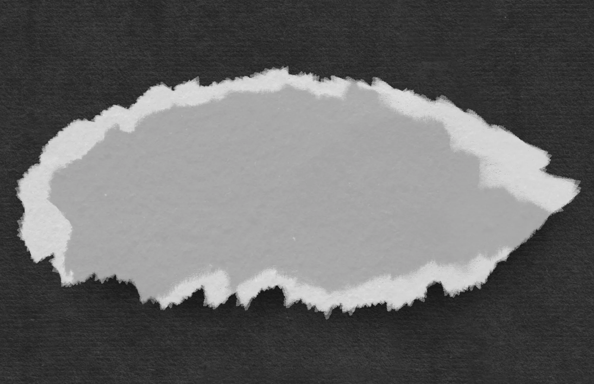
A single torn paper scrap with an irregular ripped silhouette, a bright fibrous edge that catches the light, visible paper grain, and a soft cast shadow underneath. The layer stack stays loose enough to reuse in any future Procreate collage.
What you'll need
An iPad with Procreate (latest version is best, so the brushes import cleanly)
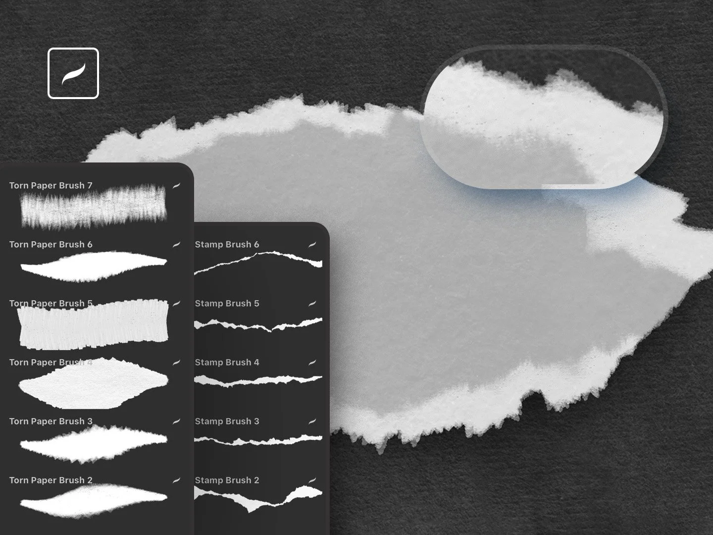
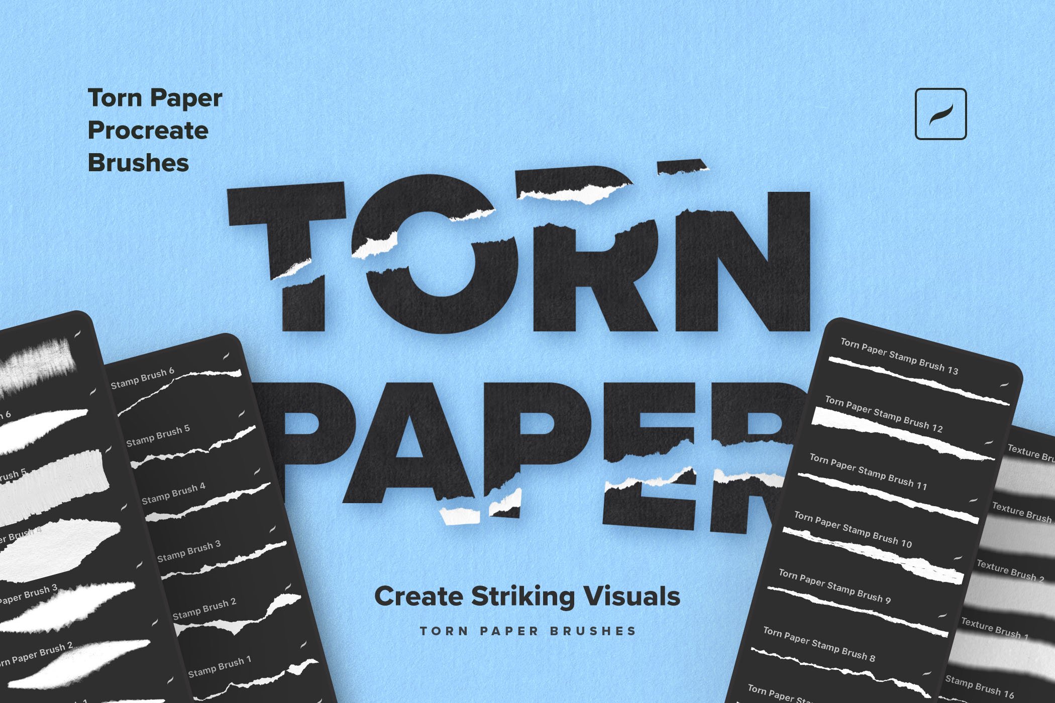
The Torn Paper Procreate Brushes by Creative Veila — 7 paper rip brushes, 16 stamp brushes, 6 texture brushes, plus an illustrated install guide
An Apple Pencil or any Procreate-compatible stylus
A canvas at 1920 × 1080 px, 300 DPI — or whatever size your final piece needs
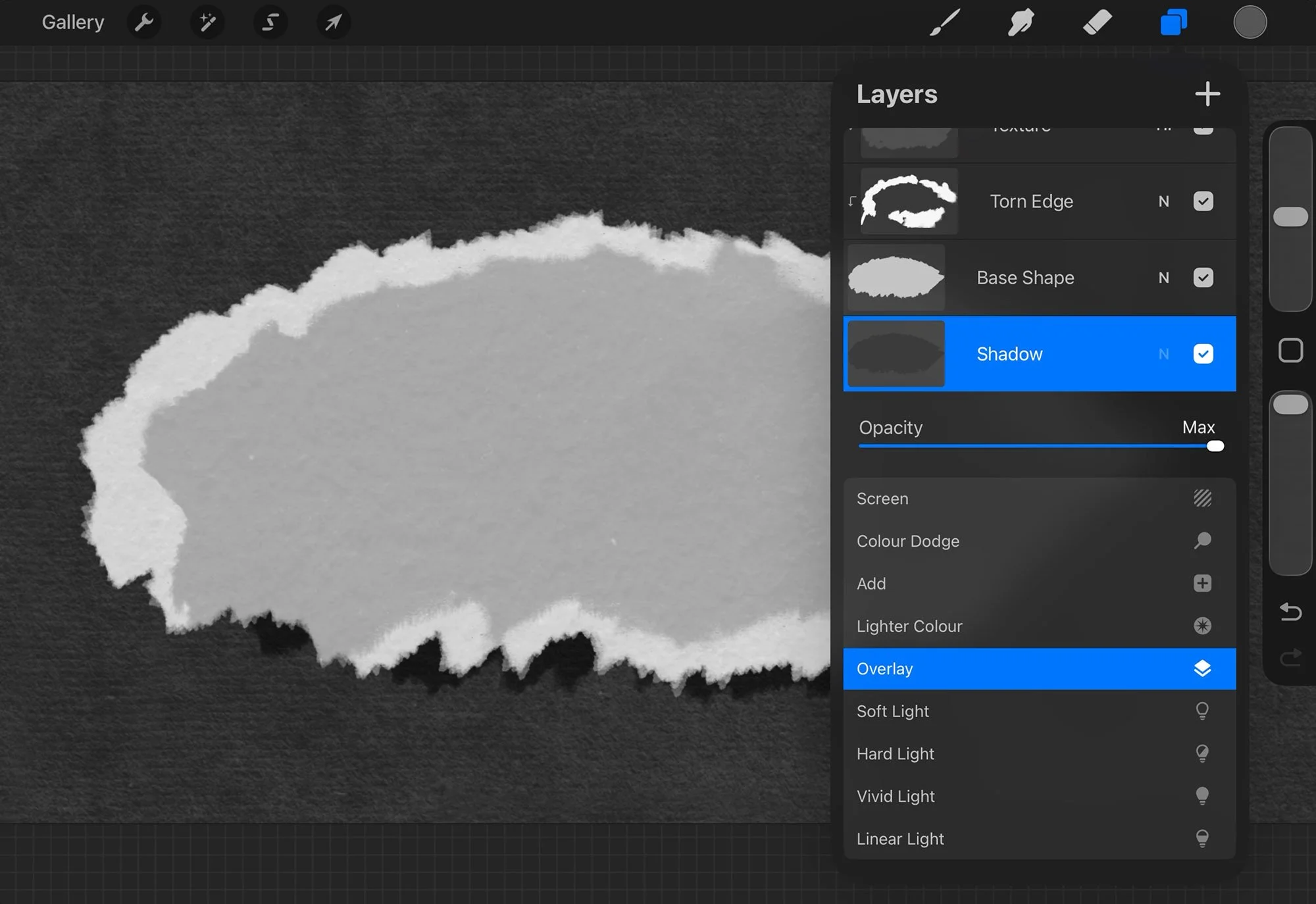
A quick word on the layer stack before we draw anything. Don't think of this as one drawing — think of it as a little paper object built in five parts, bottom to top: Background → Shadow → Base Shape → Torn Edge → Texture. That order is the whole reason the result stays flexible. The base is the paper, the edge is where it frays, the texture is the grain you can almost feel, and the shadow is what gives it weight.
Step 1. Set up the canvas
Make a new canvas. I work at 1920 × 1080 at 300 DPI — it's a clean horizontal frame that crops nicely for the blog, product shots, YouTube, and social.
One thing I'd tell you from experience: if this scrap is headed into a bigger collage, start larger than you think you need. Torn edges and paper grain hold up beautifully when you scale them down, and fall apart the second you stretch them up.
Step 2. Lay down a dark paper background
Pick a deep charcoal, black, or muted neutral, fill the background layer, then run one of the paper texture brushes lightly over it. Keep it quiet — the background is the stage, not the show.
It earns its place for two reasons: a dark ground makes the bright torn edge pop, and the texture gives the whole piece that printed, tactile feel rather than a flat digital blank. If it reads too even, go back over it with a slightly different dark tone. Just don't let it get busy — the paper is still the star.
Step 3. Stamp the base shape
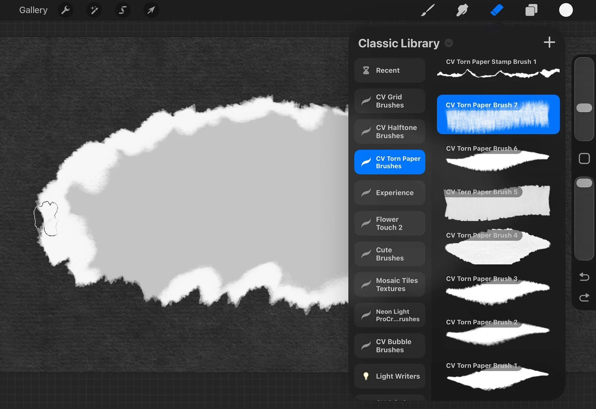
New layer, name it Base Shape, and pick a light paper color — warm white, soft grey, an off-white that isn't pure white. Open the Torn Paper set, grab a rip brush or a large torn paper stamp, and lay down your main shape nice and big.
Don't chase a perfect outline. Real torn paper is never balanced — the good ones are a little lopsided, heavier on one side, broken here and there, ragged in the corners. That awkwardness is the realism. If your shape comes out too smooth, take a smaller rip brush and nibble a few irregularities into the edge. You're after believable damage, not symmetry.
This step does two useful things:
It makes the white torn edge easy to see
It gives the whole composition a printed, tactile surface
If the background feels too flat, add a second pass with a slightly different dark tone. Avoid making the texture too busy at this stage, because the main paper shape still needs to remain the focus.
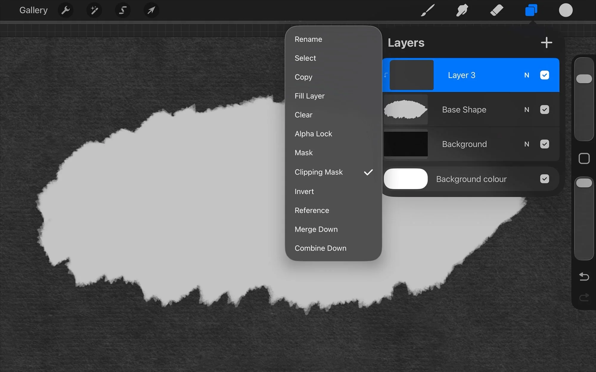
Step 4. Clip a brighter torn edge on top
New layer above Base Shape, name it Torn Edge, then tap the layer and turn on Clipping Mask. This is the move that keeps the whole thing clean — every mark you make from here stays locked inside the paper silhouette, so you can paint freely and nothing spills onto the background.
Now switch to a color close to white and a smaller torn paper brush, and work the rim in short passes. You're building up the lifted fiber where light would catch the tear — the broken edge, the thin points, the frayed corners. Use this layer to describe the rip, not redraw the shape. The base gives you the paper; this layer gives you the torn.
Step 5. Break the repetition
Here's where most torn-paper work gives itself away. Stamp brushes are fast, but the eye spots a repeated shape instantly. So as you refine the edge, mix it up: nudge the brush size between strokes, rotate the canvas as you go, alternate between two or three rip brushes, dab instead of dragging every time, and let some stretches of the edge stay calmer than others.
A trick I lean on: zoom in to work the detail, then zoom out often. If the edge only looks good up close, it's too fussy for the final piece. If it vanishes when you pull back, bump the contrast between the paper body and the edge.
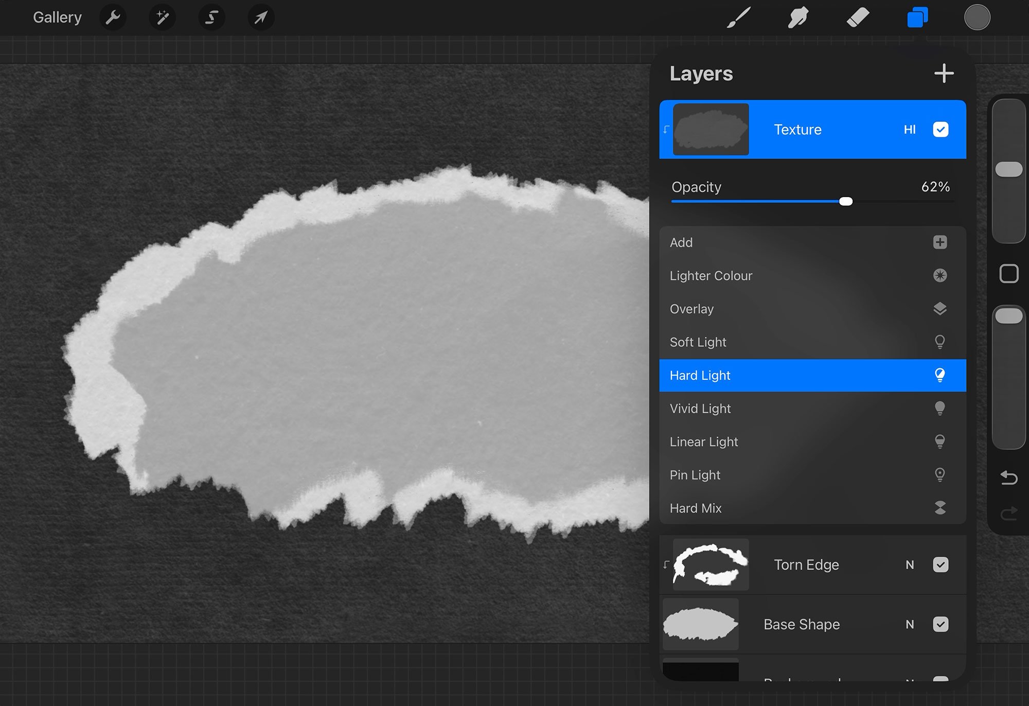
Step 6. Add the surface grain
New layer above Torn Edge, name it Texture, and clip it too (tap → Clipping Mask). Take one of the paper texture brushes and work across the whole shape — center as well as edges. You want grain on the paper body, not a coat heavy enough to bury the rip.
Set the Texture layer's blend mode to Hard Light, then pull the opacity back. I usually land around 62% — enough to feel the grain, not so much that it eats the paper color underneath. If Hard Light feels too aggressive on your art, drop the opacity before you reach for a different blend mode. Small opacity tweaks almost always keep it more natural.
Step 7. Drop the shadow
New layer below Base Shape, name it Shadow. Paint a soft dark shape under the paper — grey or black — offset slightly down and to one side, then set the layer to Multiply so it sits naturally into the textured background.
The shadow is what makes the paper feel physical. Too little and the scrap reads like a flat sticker; too much and it starts to look like a slab. If it's harsh, soften it with Gaussian Blur (Adjustments → Gaussian Blur) or ease the opacity down. A good paper shadow is shallow — it adds separation without becoming the first thing you notice.
Step 8. Step back and finish
Hide the interface and look at the whole thing at full size. Four questions: does the outer shape feel handmade and irregular? Is the torn edge readable against the paper? Has the surface got enough grain? Does the shadow plant the scrap on the background?
When you tune, go in this order — shape first, then edge, then texture opacity, then shadow softness, then background contrast. Fixing the polish before the silhouette is right is the fastest way to overwork a piece, so resist it.
Where to take it from here
Once the scrap is done, the same workflow opens up a lot of doors. Clip a photo inside the paper shape, stack several torn pieces into a digital collage, build editorial headers and magazine-style layouts, add handmade edges to social graphics, or cut torn strips into labels, frames, and dividers. For a clean graphic look, keep the paper bright and the shadow minimal. For a distressed, vintage collage, push warmer tones, heavier texture, and rougher edges.
If you work in Photoshop instead, the same torn paper logic translates straight across — same layered build, just with brushes and styles instead of stamp brushes. The Photoshop version of this tutorial covers the type-based take on the effect, useful when the torn paper is the headline rather than the background.
When it's not quite working
The edge looks stamped. Vary the brush size, rotate the canvas, and swap between different rip brushes. Never repeat the same stamp at the same scale down a whole edge.
The paper looks flat. You're probably missing a layer. Add the clipped texture for surface, and a separate Multiply shadow for depth.
The texture spills past the shape. The Texture layer isn't clipped to Base Shape — tap it and turn Clipping Mask on.
The torn edge is hard to see. Raise the contrast: a brighter edge color, or a slightly darker paper body.
The shadow looks too digital. Lower the opacity, soften with blur, and shorten the offset. Paper shadows are shallow unless the paper is curled or lifted off the surface.
The brushes behind this
Everything above is built with the Torn Paper Procreate Brushes pack — 7 paper rip brushes for drawing and refining a custom edge, 16 stamp brushes for a fast premade torn shape, 6 texture brushes for that surface grain, and an illustrated how-to-install guide to get you going.
Grab the set and you can make ripped edges, collage scraps, and textured paper details right inside Procreate, no scanning or cleanup required.
If you'd rather build the same effect on the Photoshop side, we've got a companion walkthrough: How to Create a Torn Paper Text Effect in Photoshop.
This tutorial is written for Procreate on iPad. For the smoothest experience, update to the latest version before importing the brushes.
FAQs
-
Yes. The most flexible method is to build the effect in layers: a paper base shape, a clipped torn edge layer, a clipped texture layer, and a separate shadow layer underneath.
-
Use a combination of paper rip brushes, torn paper stamp brushes, and paper texture brushes. Rip brushes help create the irregular edge, stamp brushes speed up the base shape, and texture brushes add realistic paper grain.
-
A clipping mask keeps the texture inside the paper shape. This lets you paint freely while preserving a clean background and an editable paper silhouette.
-
Hard Light can work well when the opacity is reduced. In this workflow, the texture layer is set to Hard Light at about 62 percent opacity, then adjusted by eye.
-
Multiply is a strong starting point for shadows because it darkens the background naturally. Keep the shadow on a separate layer so you can blur, move, or reduce it later.