
Heat Map & Thermal Effects in Graphic Design
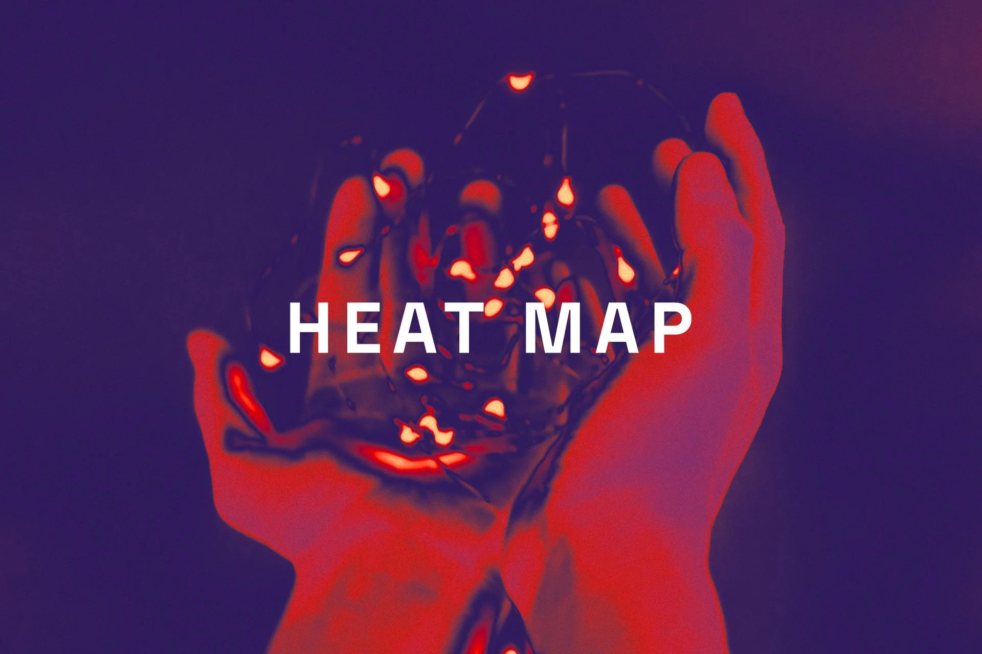
You've definitely seen it: a portrait glowing in molten orange and electric violet, like someone pointed a thermal camera at the artwork. Heat map graphics are everywhere right now — album covers, festival posters, streetwear drops, editorial spreads. So I decided to dig into where this trend comes from, why it works so well, and how you can create the effect yourself.
What Is the Heat Map Design Trend?
Thermal imaging was never meant to be pretty. Thermographic cameras translate infrared radiation into color — the hotter the surface, the brighter the tone — and for decades this imagery lived in military footage, medical scans, and building inspections.
That's exactly why designers love it. Heat map graphics carry that raw, technical, slightly unsettling surveillance vibe, and when you apply it to a human face or a familiar object, something magical happens: the ordinary becomes alien. Add the current wave of Y2K and cyber nostalgia, and you get a trend that refuses to cool down.
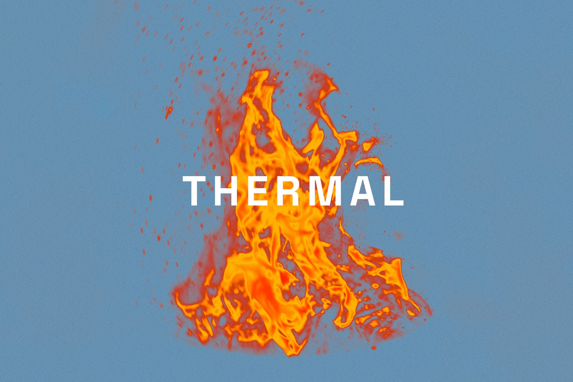
Why Thermal Graphics Work So Well
The secret is the palette. A classic thermal gradient travels from deep blue and violet through crimson and orange into blazing yellow and white — which means a single image gets to use almost the entire spectrum without looking chaotic. The gradient does the storytelling: cold to hot, calm to intense.
It's also an emotional cheat code. Warm zones pull the eye like a magnet, so a heat map effect naturally builds a focal point wherever the "temperature" peaks. You're not just colorizing a photo — you're directing attention with physics.
Heat Map Design in the Wild
My favorite example is the cover of Skepta's Ignorance Is Bliss (2019) — a grid of nine thermal camera portraits that turns family and crew snapshots into something between a surveillance feed and a gallery wall. The thermal treatment does all the emotional work: intimate moments rendered in cold, clinical infrared. The album hit #2 on the UK chart, and that artwork got dissected by every design feed for months.
The trend's pop-culture roots go back further, though. Predator (1987) burned thermal vision into everyone's memory — an entire generation knows exactly what "seeing heat" looks like because of one alien. Since then the aesthetic has drifted from sci-fi into sportswear campaigns, techwear lookbooks, and festival visuals, anywhere a brand wants to say "engineered" and "intense" without writing a word.
Where to Use Heat Map Graphics
Thermal effects shine anywhere you need instant energy: music artwork and gig posters, sportswear and streetwear prints, event branding, bold editorial openers, or social media visuals that have to survive a fast scroll. A thermal portrait on a matte black background is practically a guaranteed stopper.
One tip from our studio: use it as an accent, not wallpaper. One thermal element surrounded by calm typography hits much harder than an entire layout on fire.
How to Create a Heat Map Effect in Photoshop
You can build a basic thermal look in about five minutes with a Gradient Map. Here's the quick version:
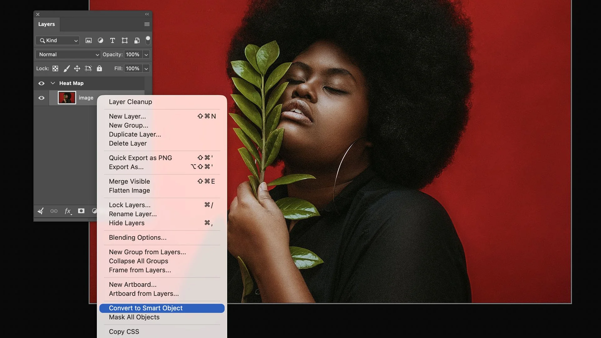
Step 1.
Open your photo and convert the layer to a Smart Object, so everything stays editable. High-contrast portraits work best.
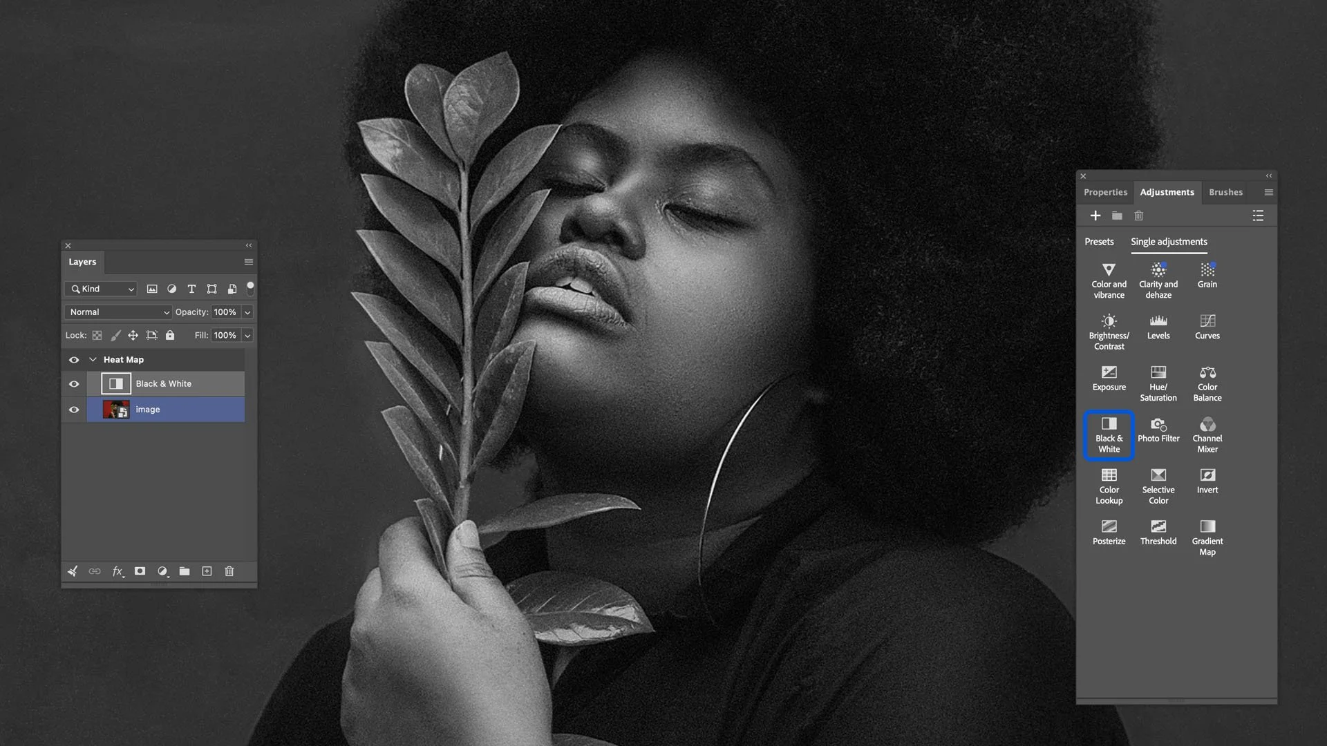
Step 2.
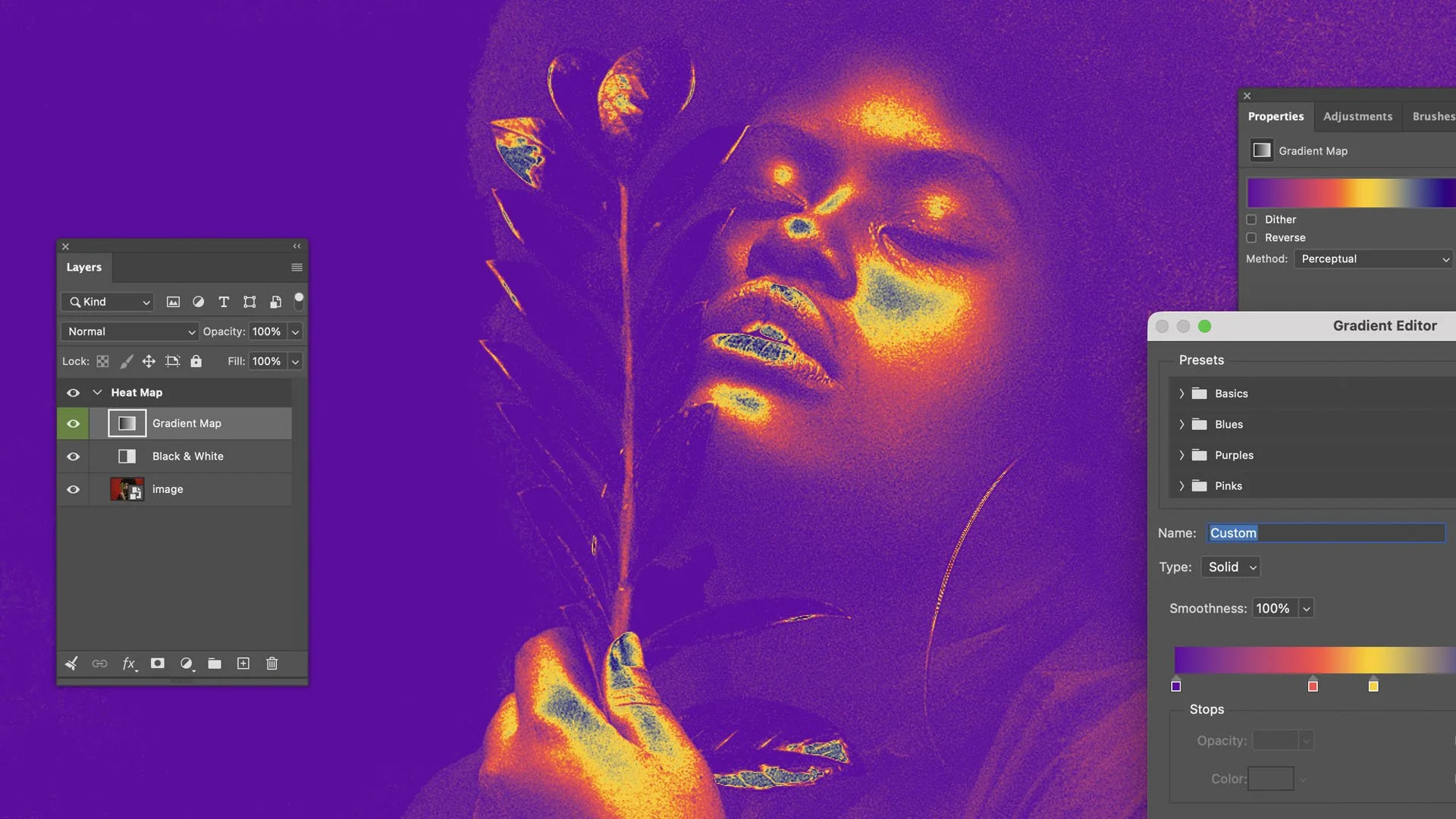
Add a Black & White adjustment layer to flatten the image into pure luminosity — thermal cameras don't care about color, only heat.
Step 3.
Add a Gradient Map adjustment layer (Layer > New Adjustment Layer > Gradient Map). Build a gradient from deep blue through violet, crimson, orange, and yellow to white. This is the classic "iron" thermal palette.
Step 4.
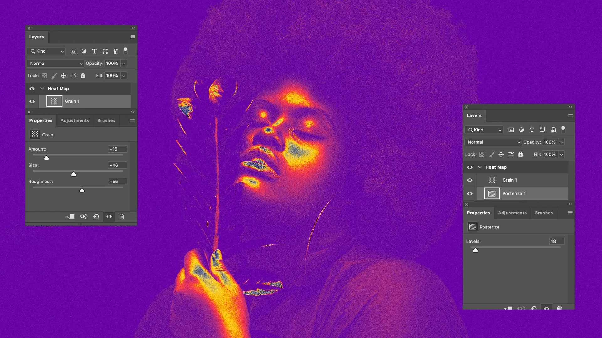
Fine-tune the mood: Posterize adds those banded temperature zones, a touch of Add Noise brings back the sensor grain, and a soft glow on a Screen-mode layer sells the infrared bloom.
Swap the source photo inside the Smart Object, and Photoshop re-renders the whole effect instantly — the same non-destructive trick we used in our halftone photo effect tutorial.
Skip the Setup with Ready-Made Thermal Effects
Building the palette is fun; matching real thermographic optics is the hard part. For our Heat Map Thermal Photo Effects pack, we studied actual thermal camera footage to recreate the lens distortions, sensor noise, and temperature banding — so you drop your image into a Smart Object and get an authentic infrared render in seconds, with multiple palettes to choose from.
Honest warning: however elaborate the effect, it's still an imitation, not a real temperature reading. A thermal camera sees heat; Photoshop only sees brightness. The effect maps the light and dark areas of your photo onto a thermal palette — so a face sitting in shadow can come out cold blue when it should be glowing yellow-orange.
If that happens, don't blame the physics — open the Gradient Map and shift the color stops, or lift the "cold" areas with a Curves tweak on the source image, until the heat lands where a real infrared camera would put it: faces, hands, anything alive.
This tutorial is created and fully compatible with the Adobe Photoshop CC version. For the best experience, we recommend using the latest Creative Cloud version of the app.

This pack of 10 beautiful effects is easy to use and quite variable, allowing you to create stunning thermal camera effects with just a few clicks.